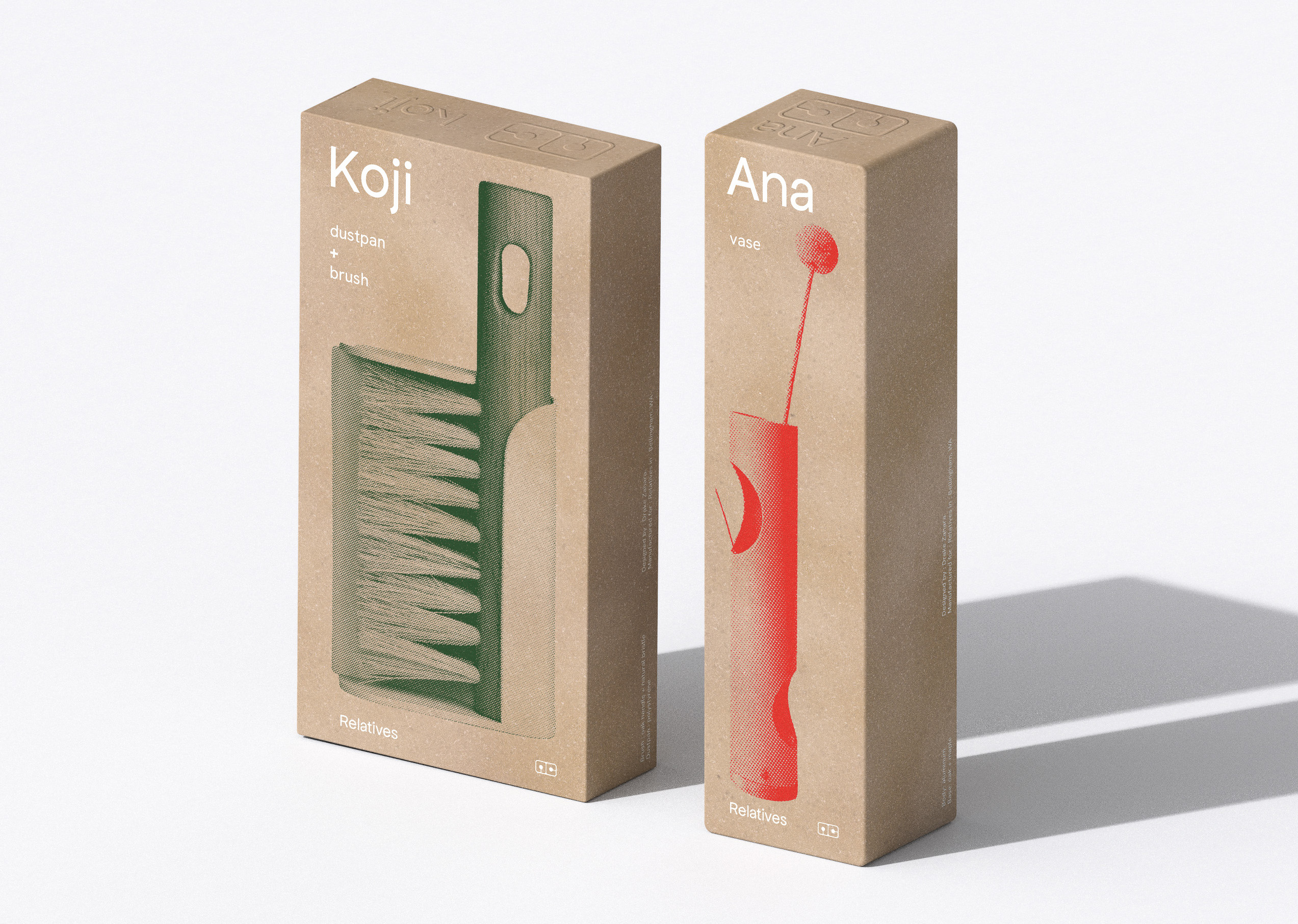
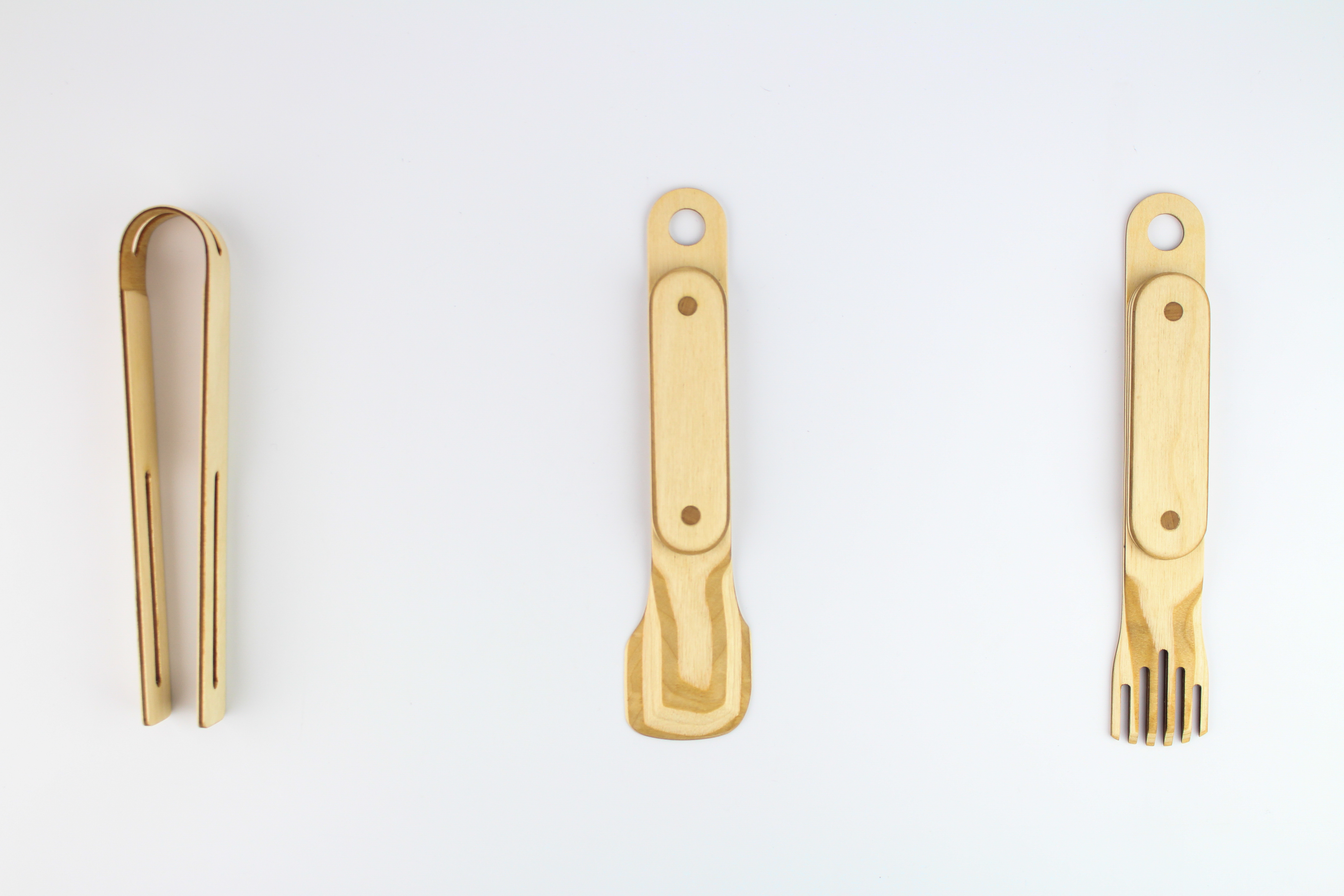
Relatives
Branding + Identity, Packaging
2022
2022
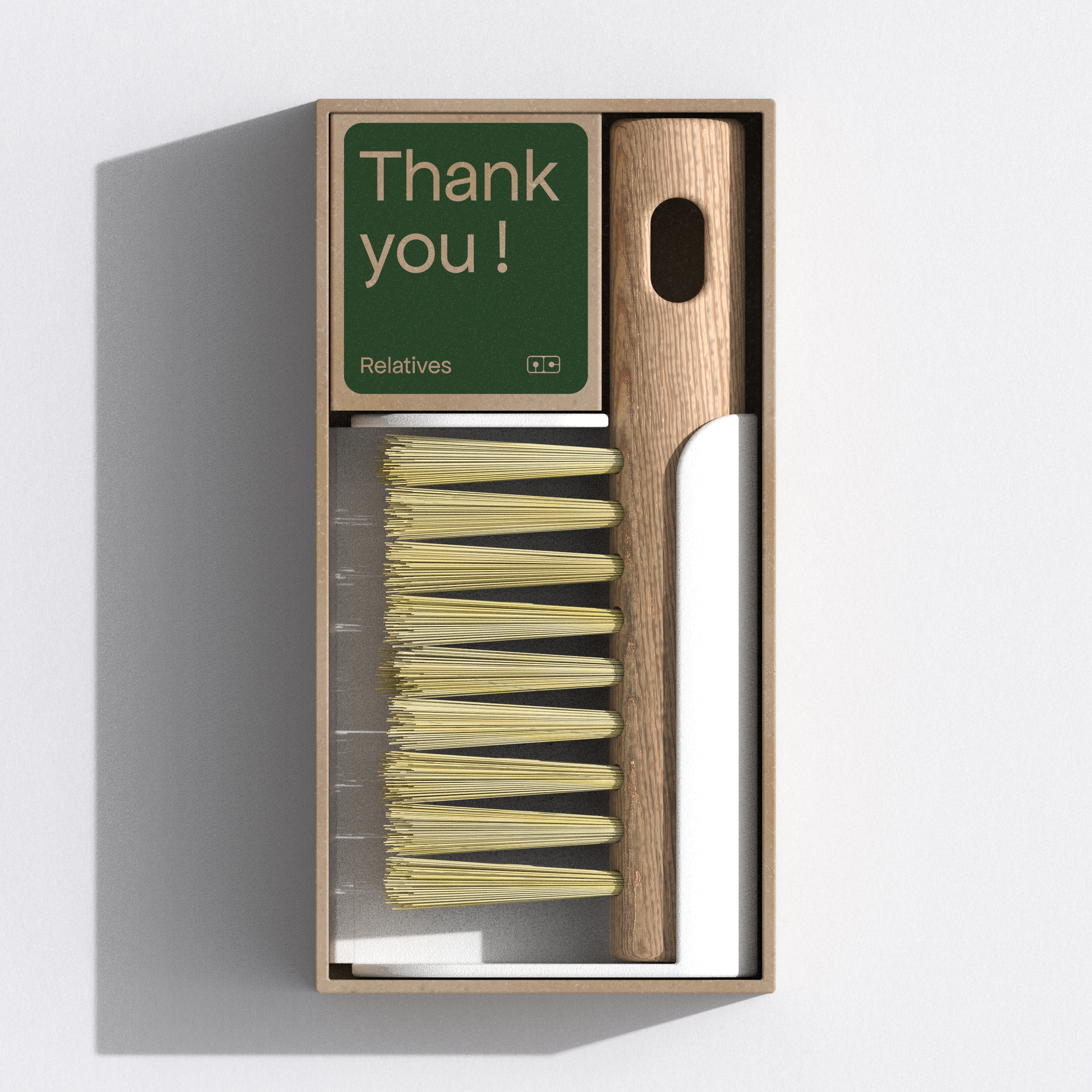
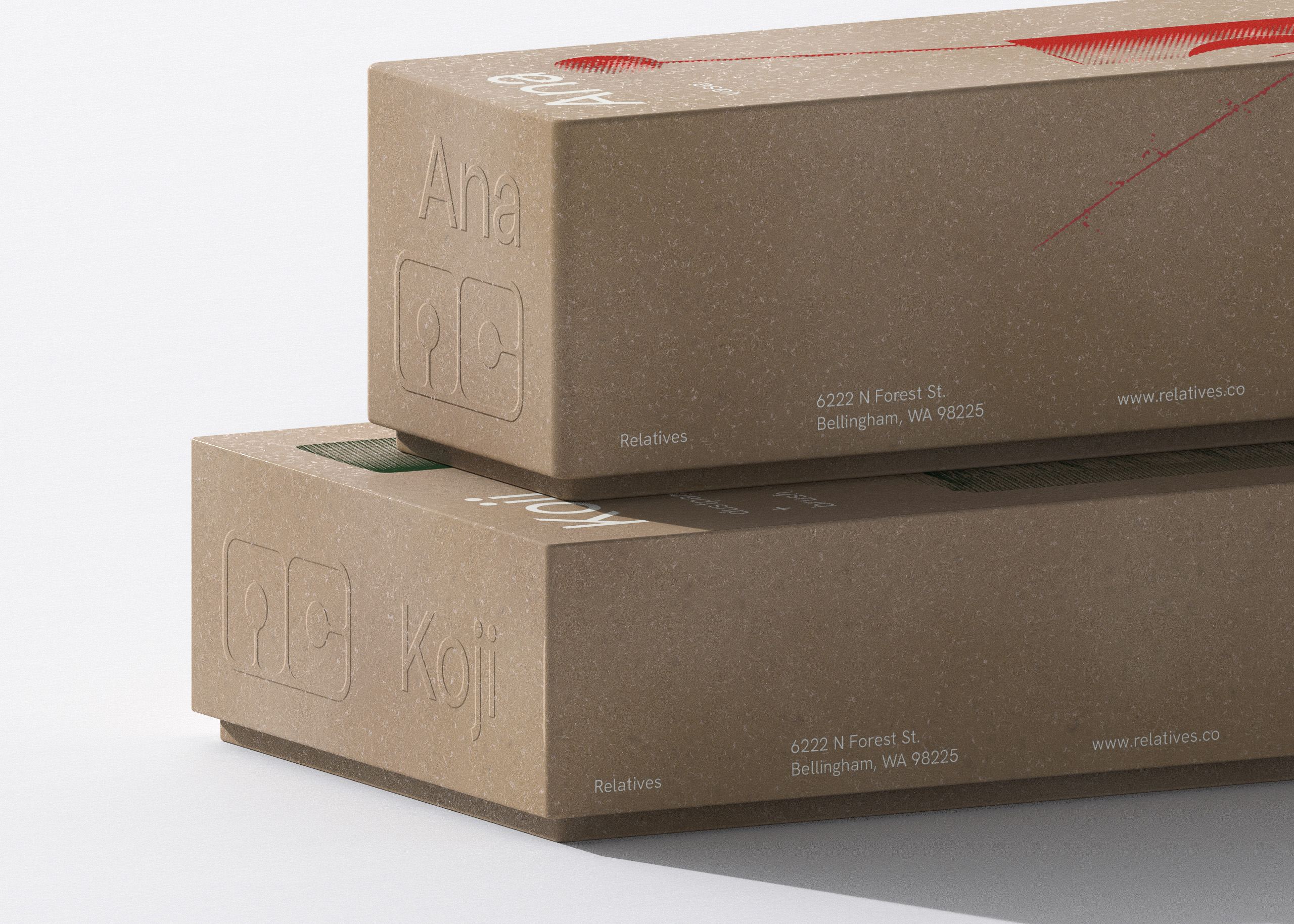
I worked with product designer Drake Zahara to develop Relatives: a brand for a series of household objects designed for Western Washington University’s Industrial Design program.
+ Mark + identity design, packaging design, copywriting:
+ Product design, fabrication, photography + final renders:
+ Product design, fabrication, photography + final renders:
Olivia Chasteney
Drake Zahara
Drake Zahara

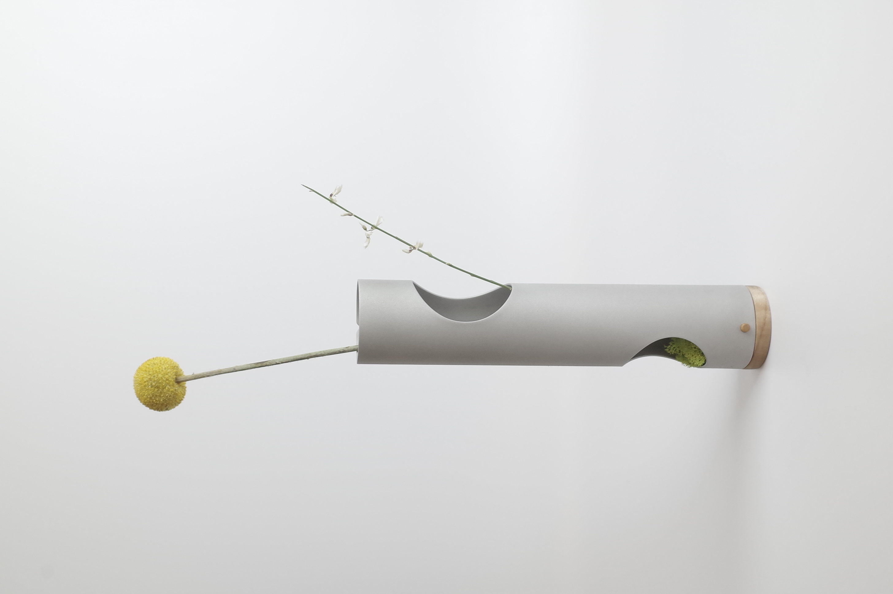


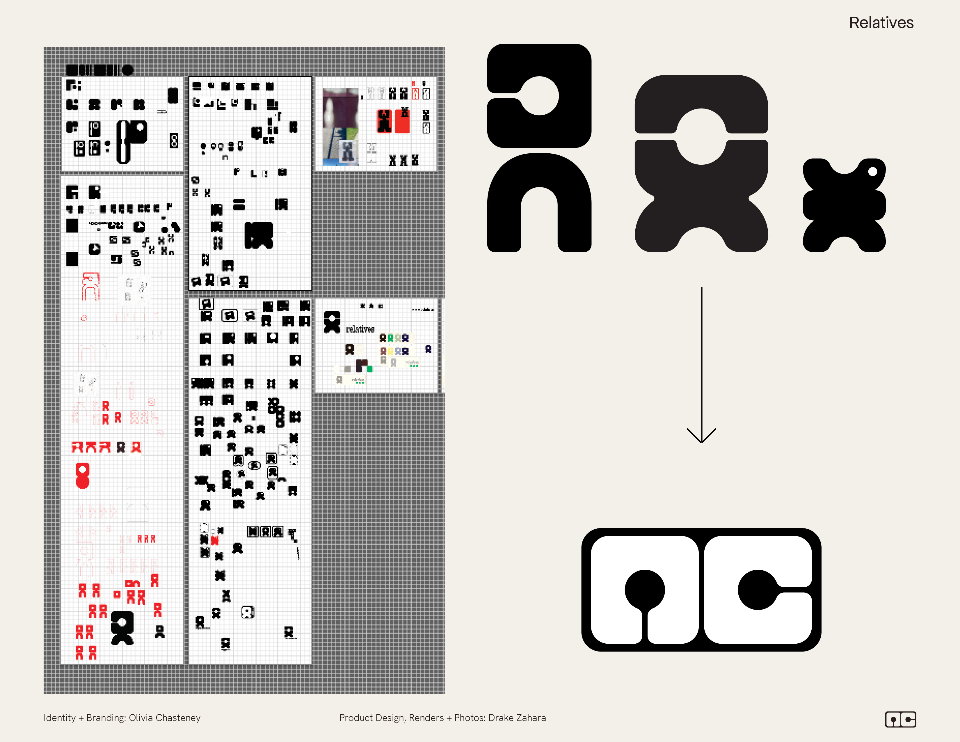
The name relatives was based partly on the product designer’s convention of naming each project after a family member. This laid the foundation of the identity: it would be based on relationships, and emphasize how the products fit together as parts of a whole.
The idea of family influenced the brand concept a lot: thinking about how these objects are a family of their own, and how they would join the customer’s family, in a sense, when they were purchased.
How would they interact with the other objects in the customer’s home? How would the customer interact with them on the day to day? What kind of relationship does someone have to a dustpan? These were the kinds of questions that led us to the core of the brand.
My challenge in designing a visual identity was to emphasize these relationships: of the products to each other, to the designers, to the context that they live in - while still leaving just enough undefined so that the customer is invited to envision their own unique relationship to the products.
+
Outcomes


+
Brand Guidelines


+
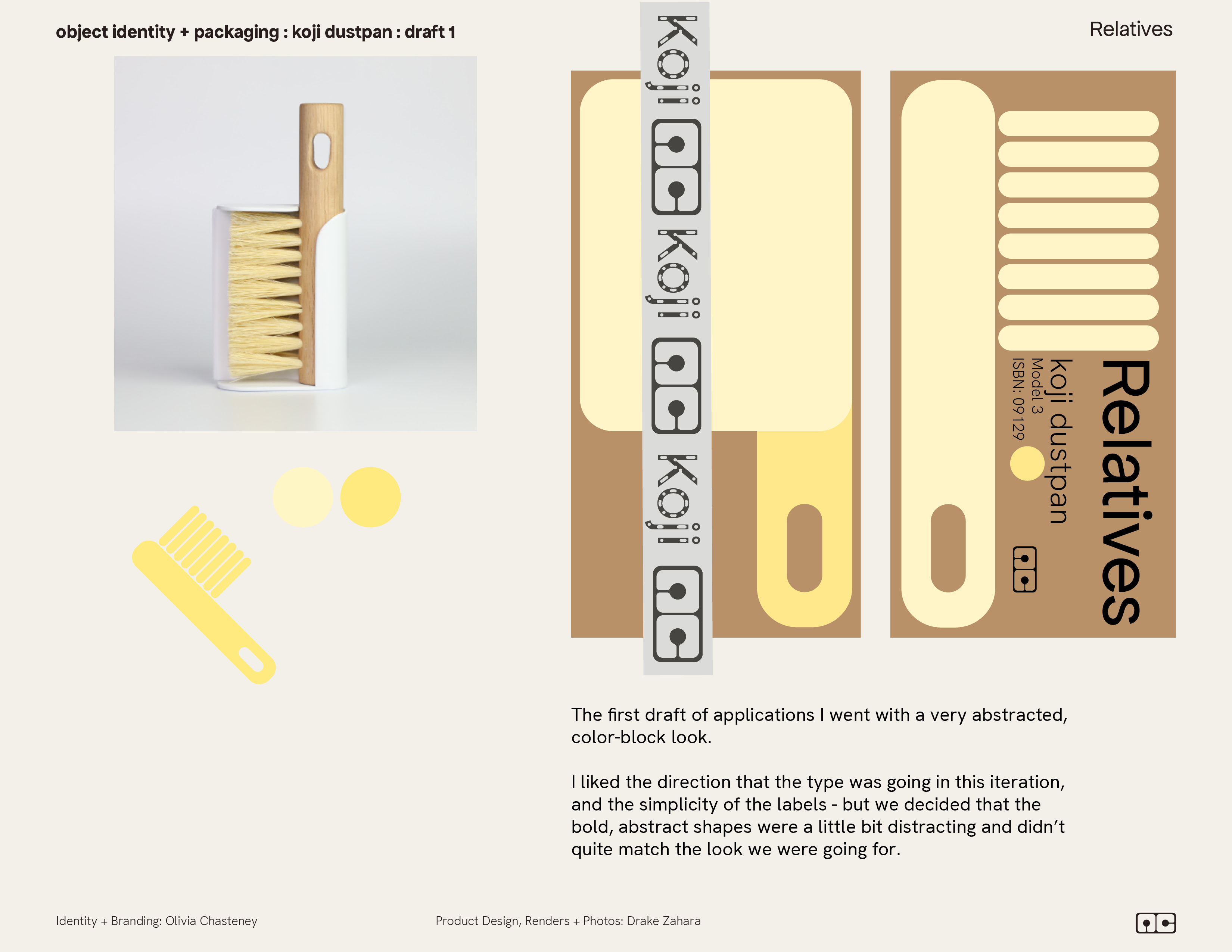
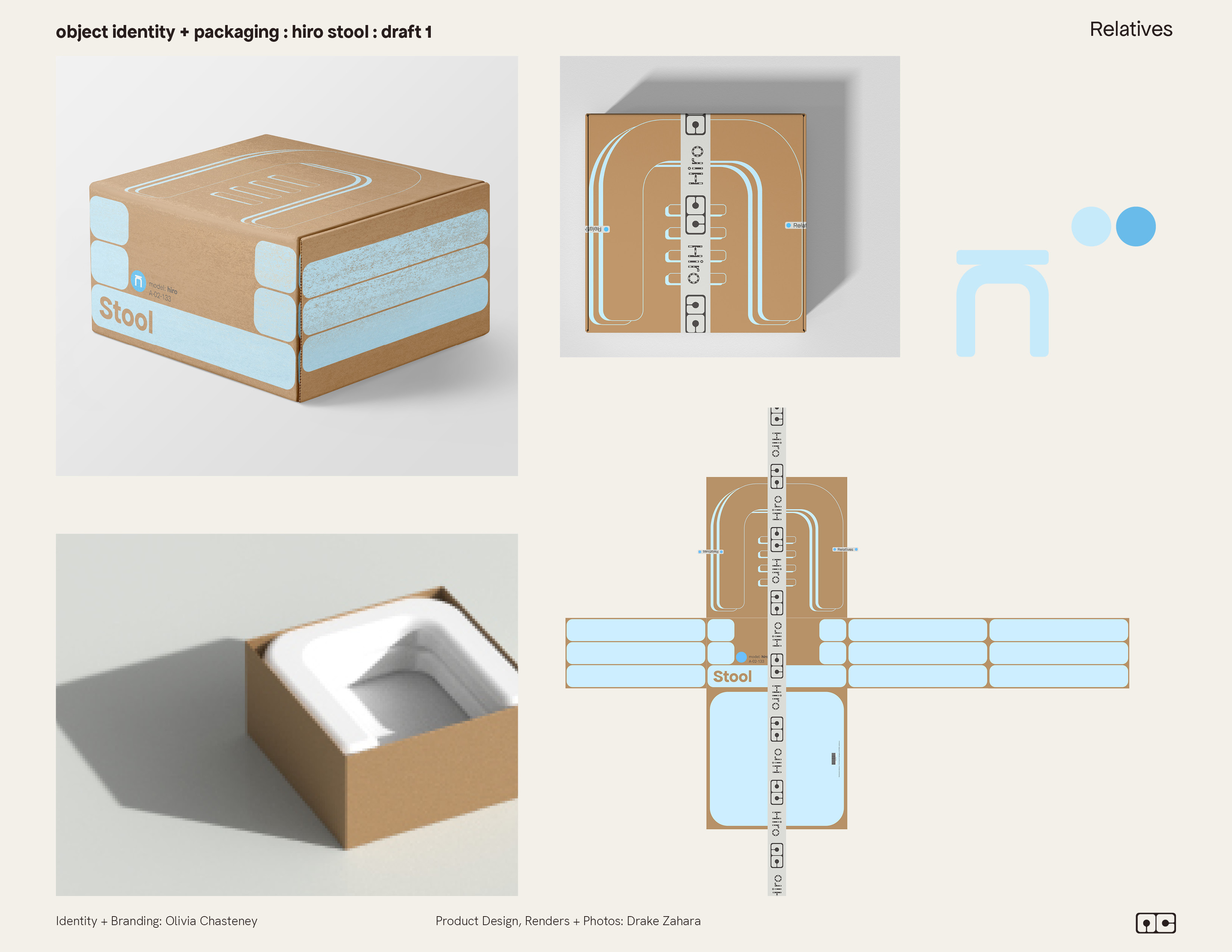
Process
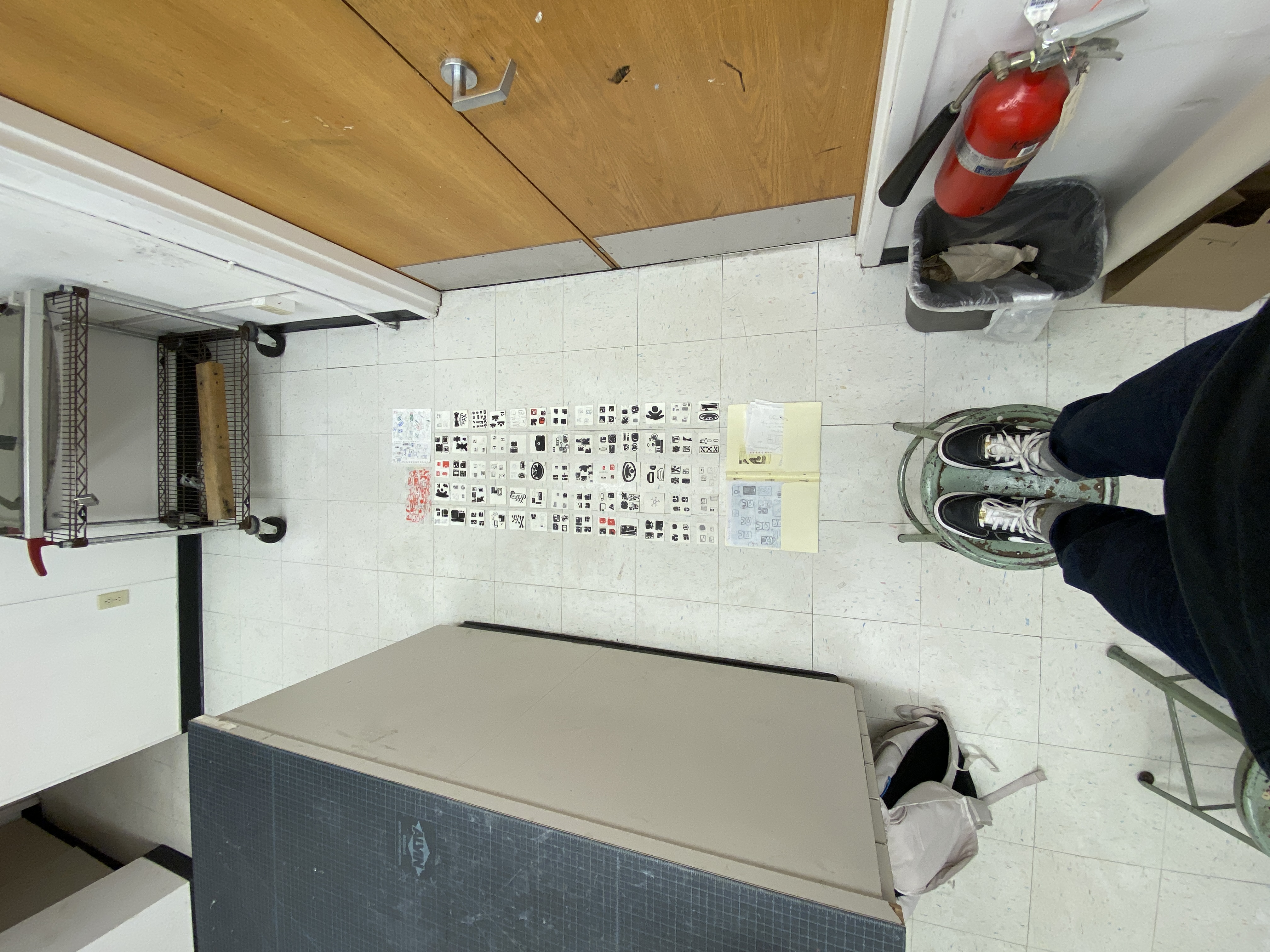

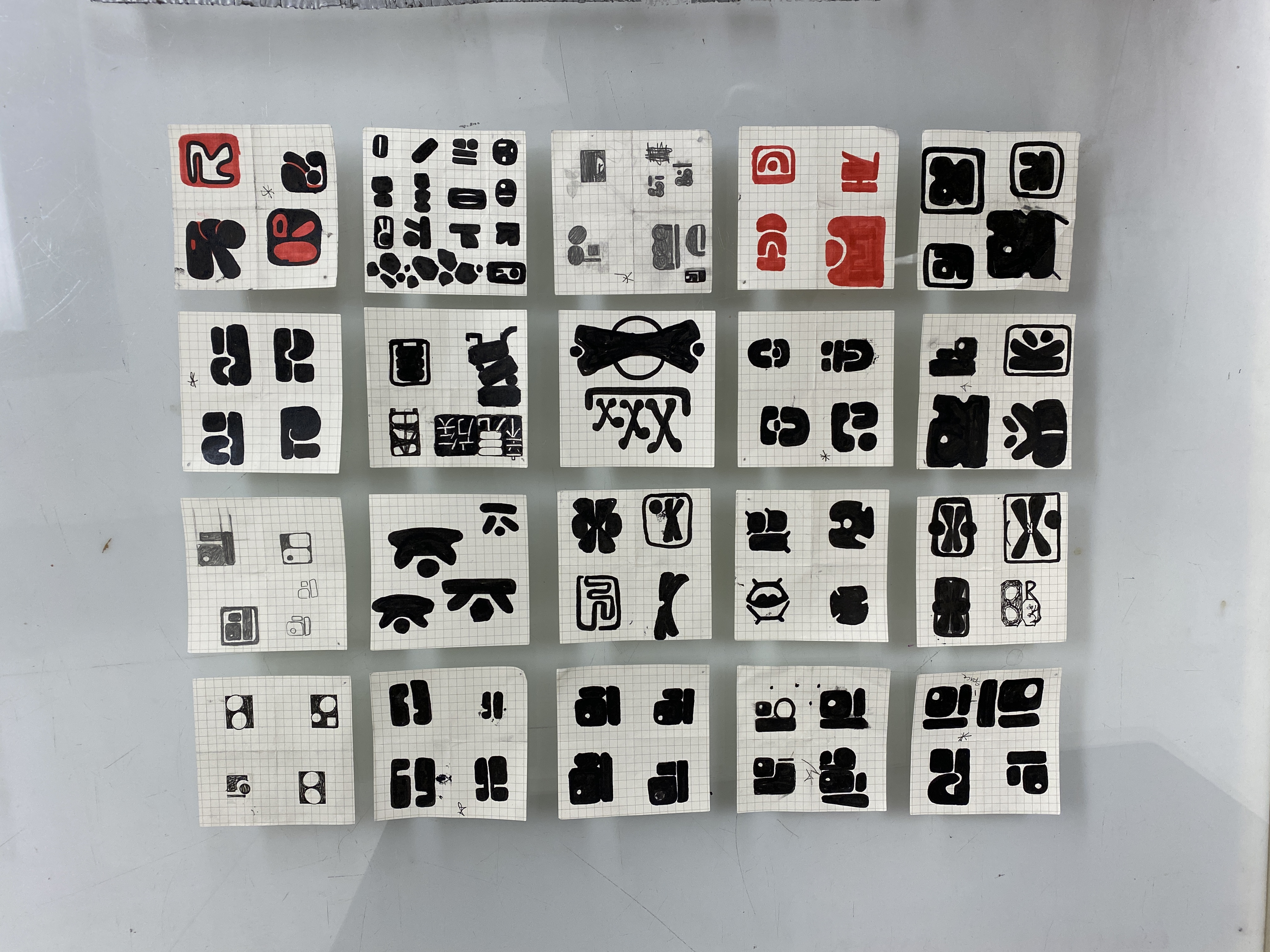
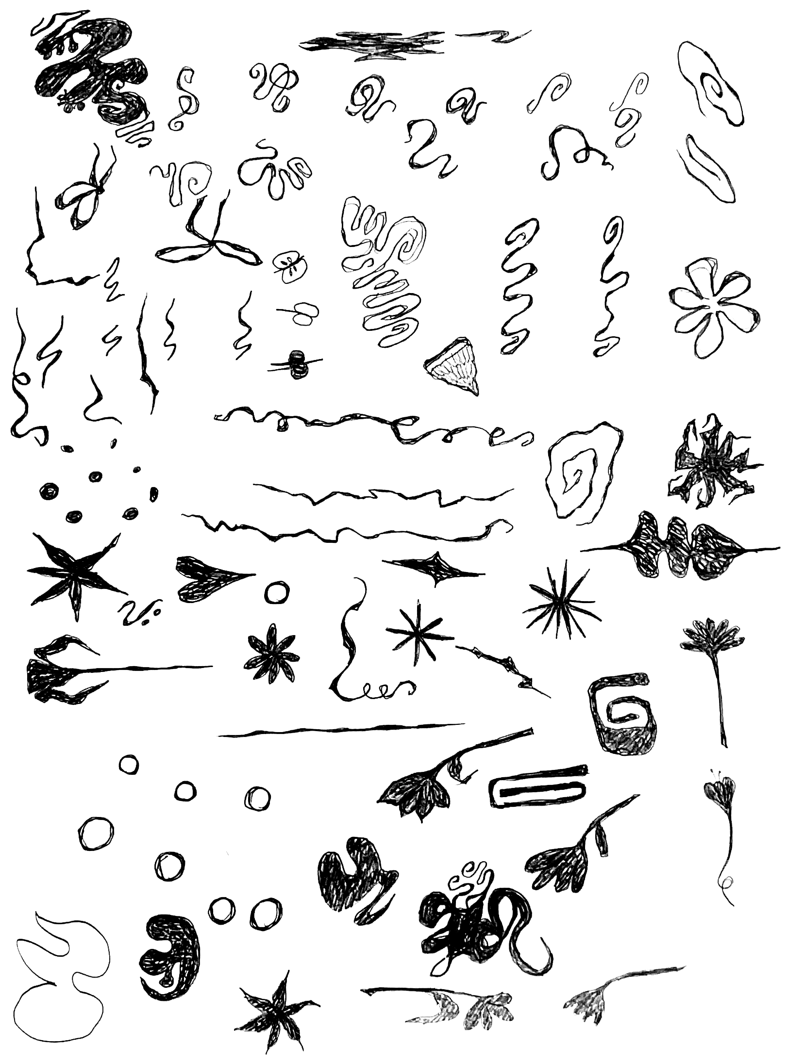
Initial sketches
...
I knew that for the logomark I wanted something that involved a set of visual components in some way, to communicate the idea of relationships that made up the foundation of the brand.
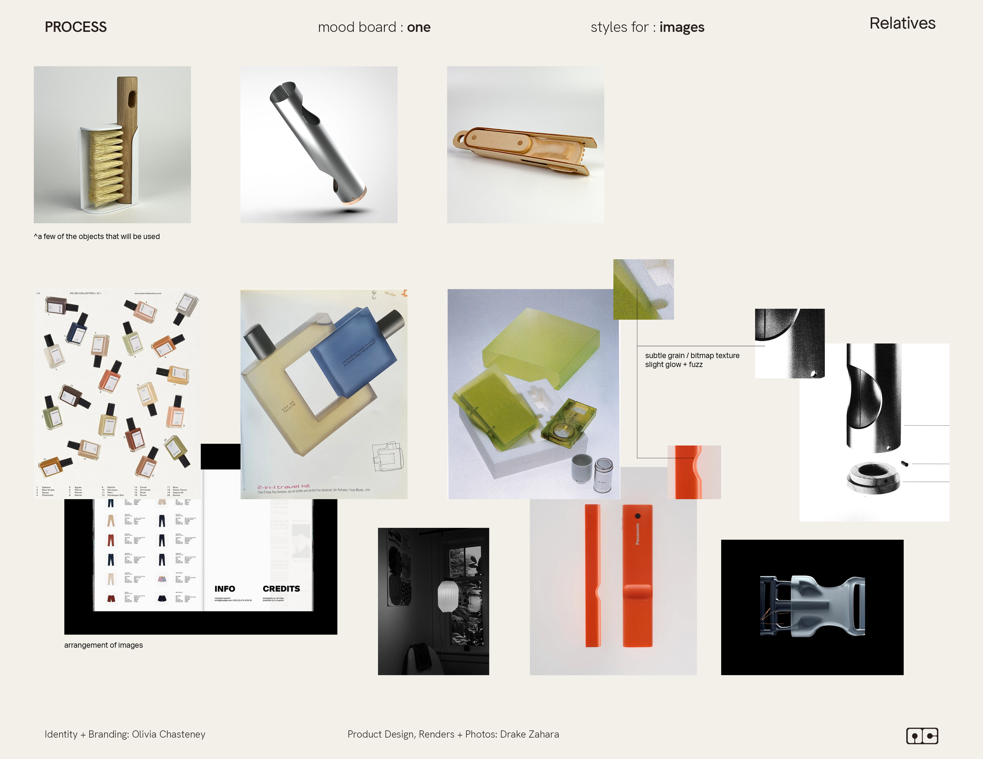
For inspiration I looked to the shapes of the objects themselves, and the shapes of hardware, tools, and things that fit into other things (locks and keys, trays full of items).
I appreciated the chance to work so closely with the product designer throughout the entire design process. Having that extra level of insight into how the objects were made and being able to reference his process in my own was a huge influence. I started with a deep dive into all of that reference material in my early mark explorations, and then worked with the product designer to narrow it from there.

Initial Designs
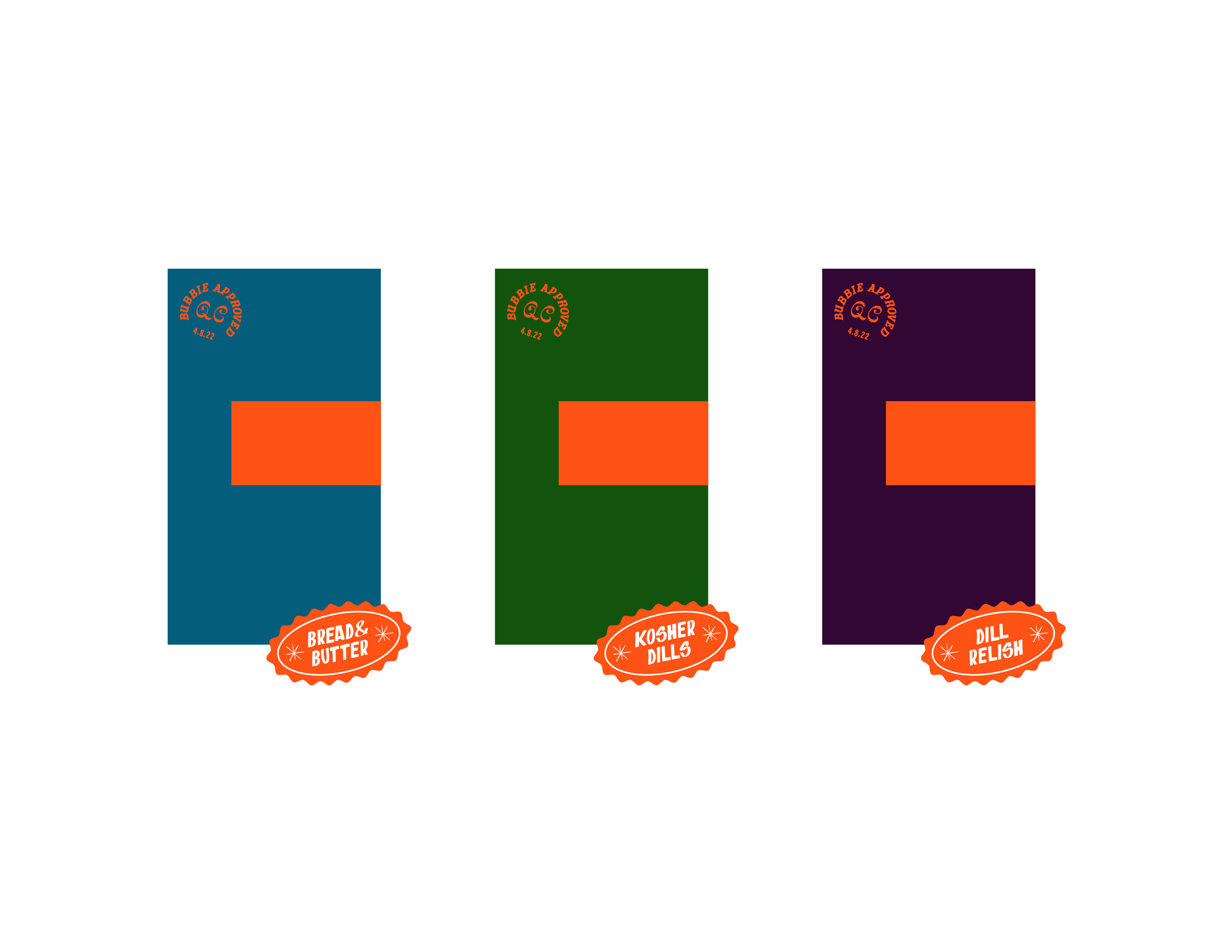
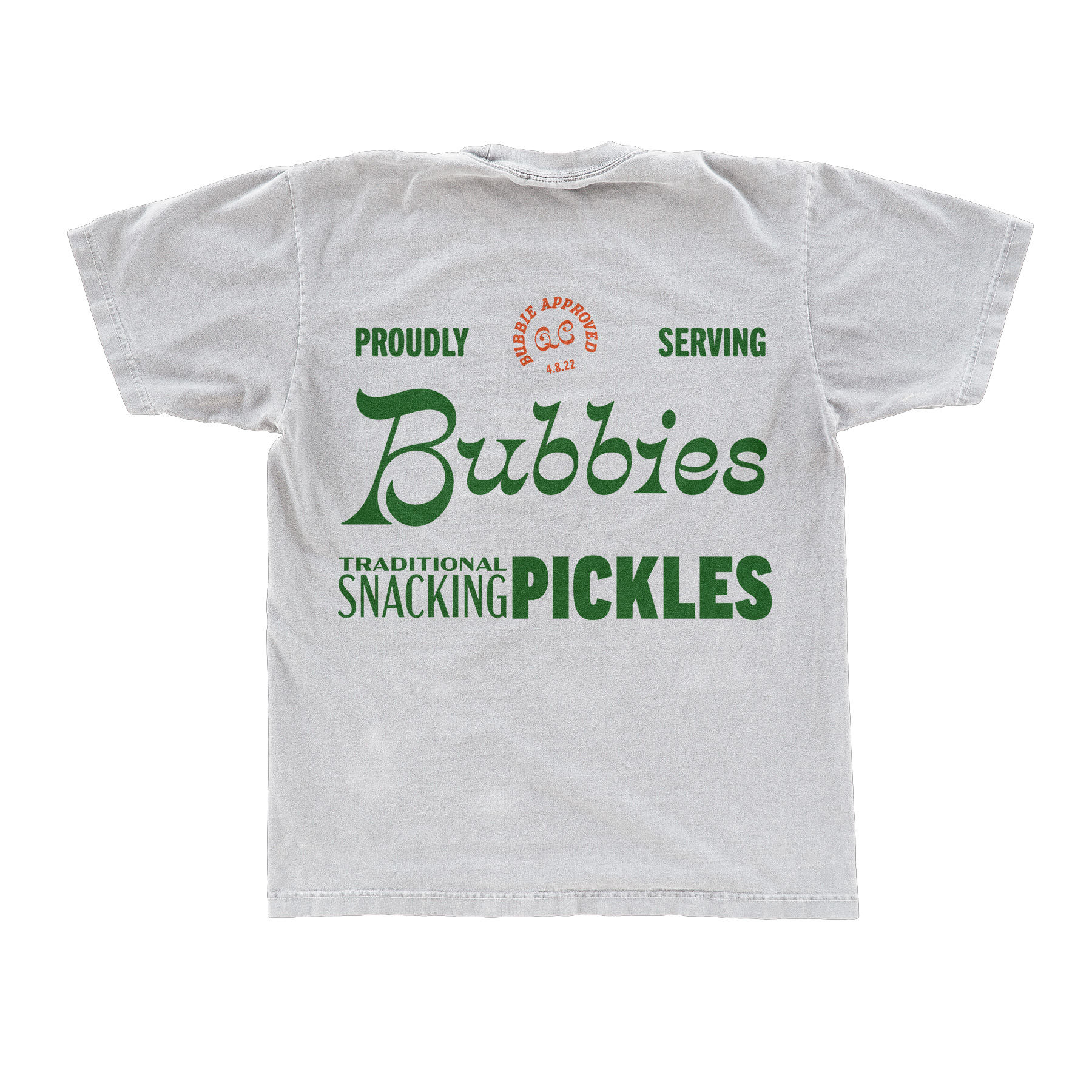
Bubbies Pickles
Branding + Identity, Packaging Design
2022
2022
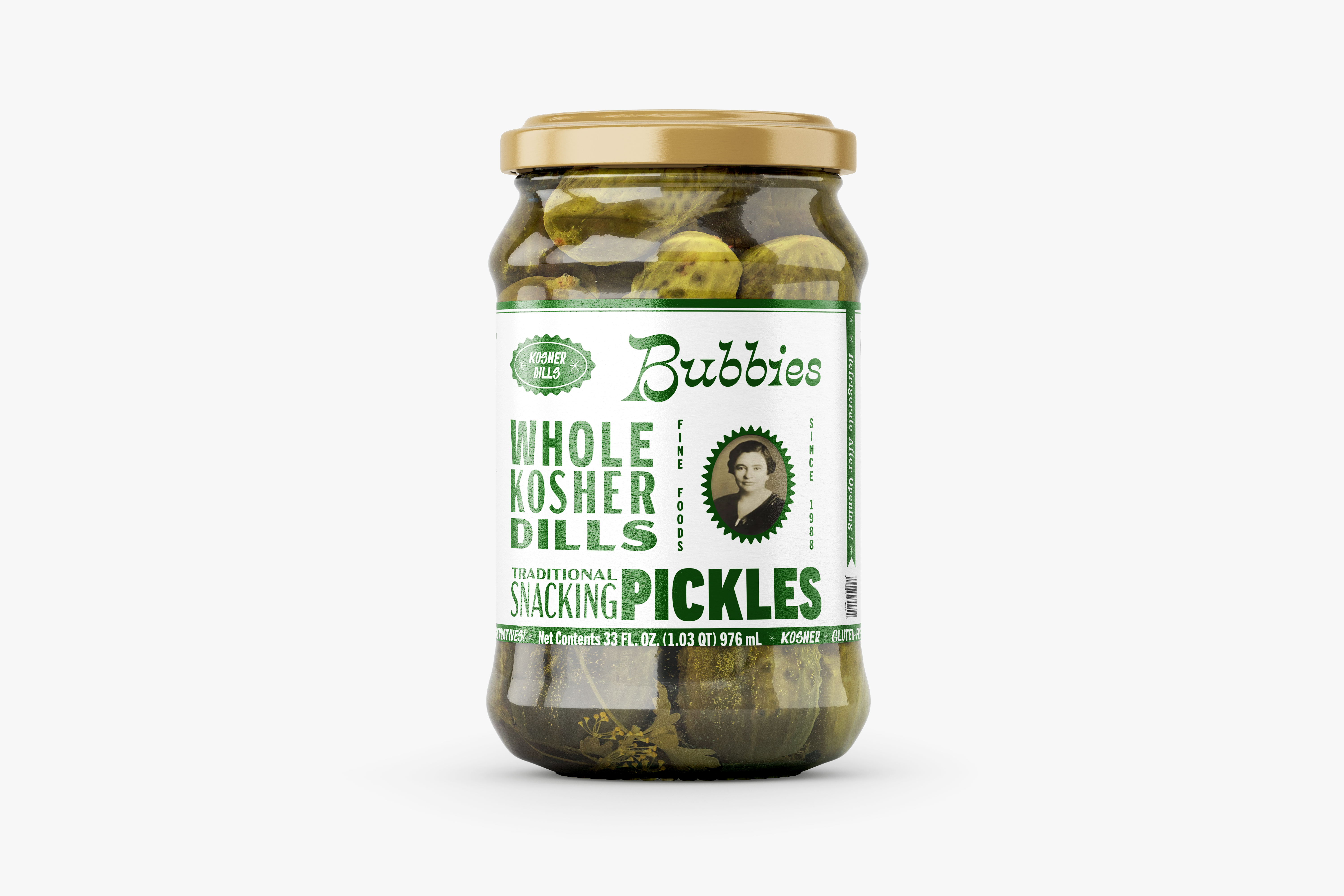
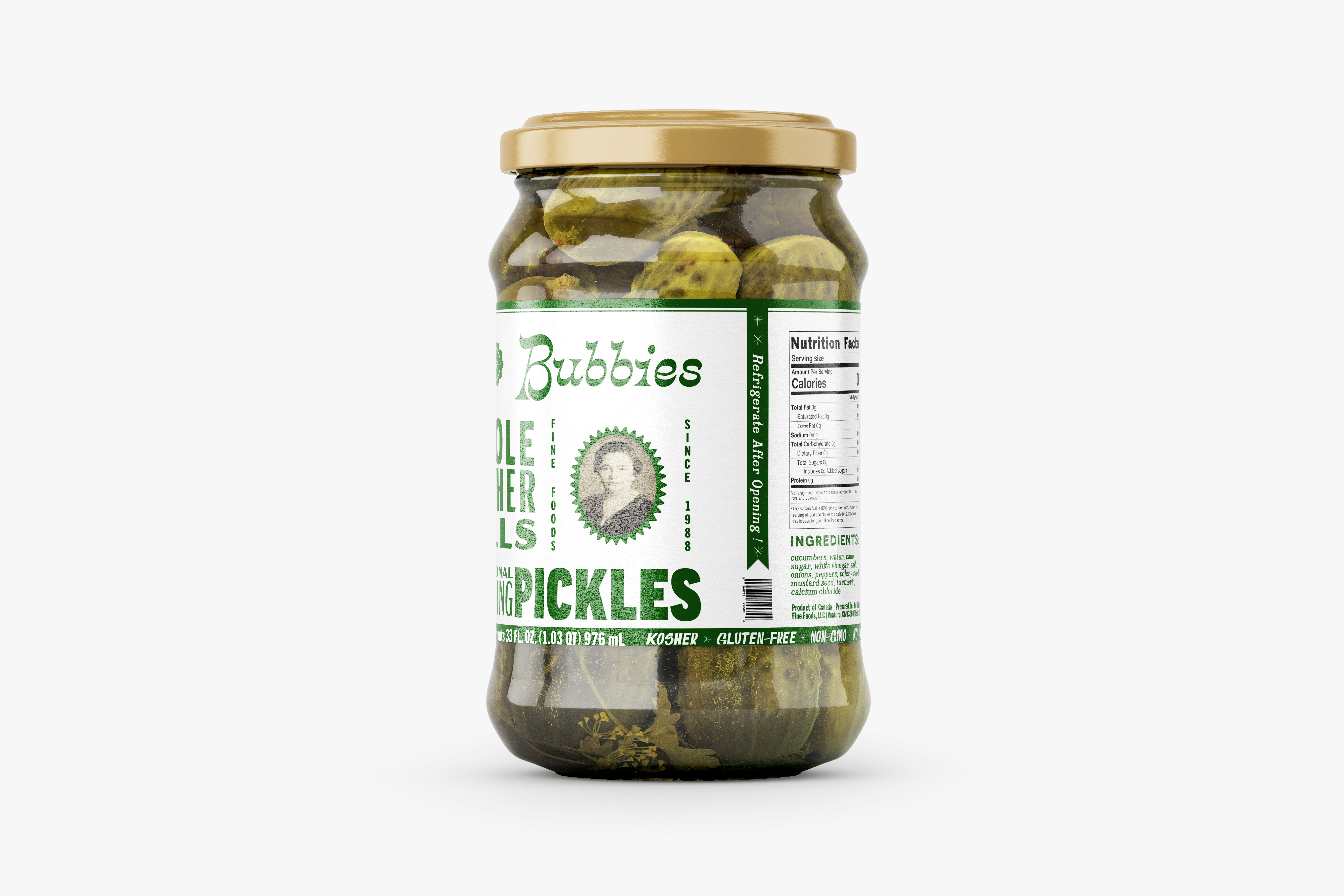
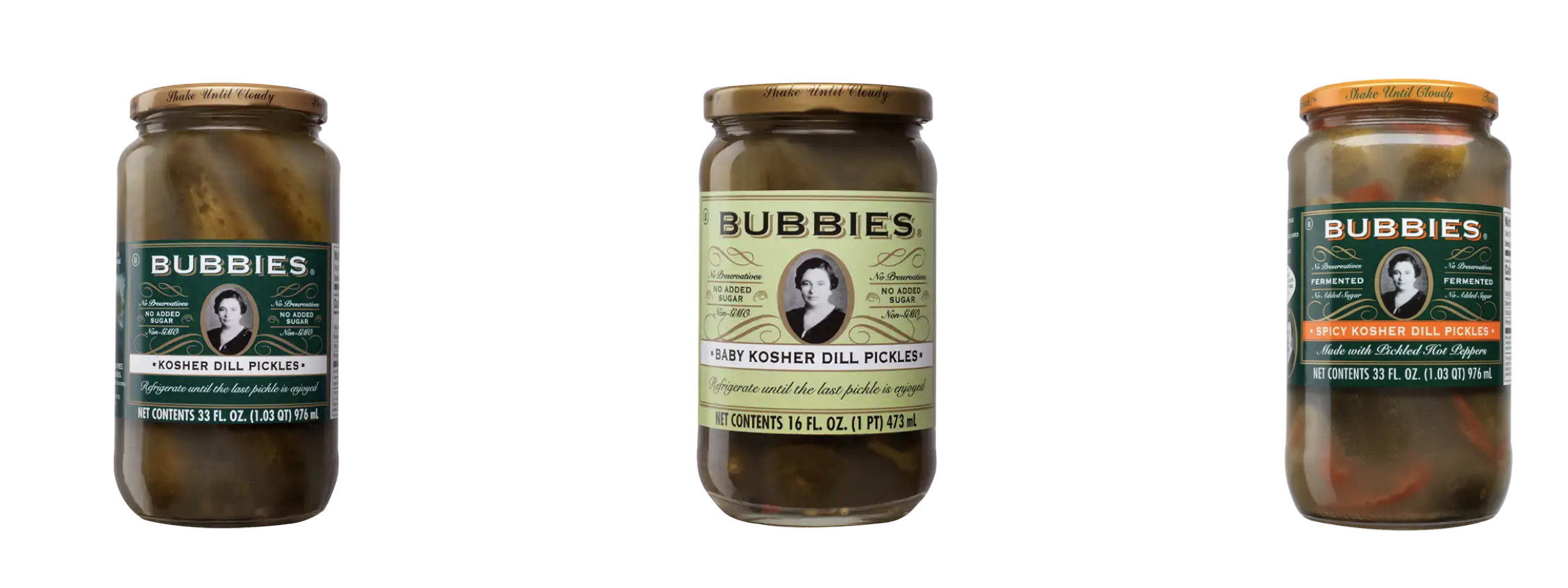
Brand Refresh + Label redesign for Bubbies, a gourmet, traditional deli-style pickle company.
Tasked with incorporating the history and family owned roots of the company into a modern package re-branding, I pulled elements from the very first iteration of Bubbies branding into a clean, classic, eye catching label.


+
Process
Referencing: A Specific History
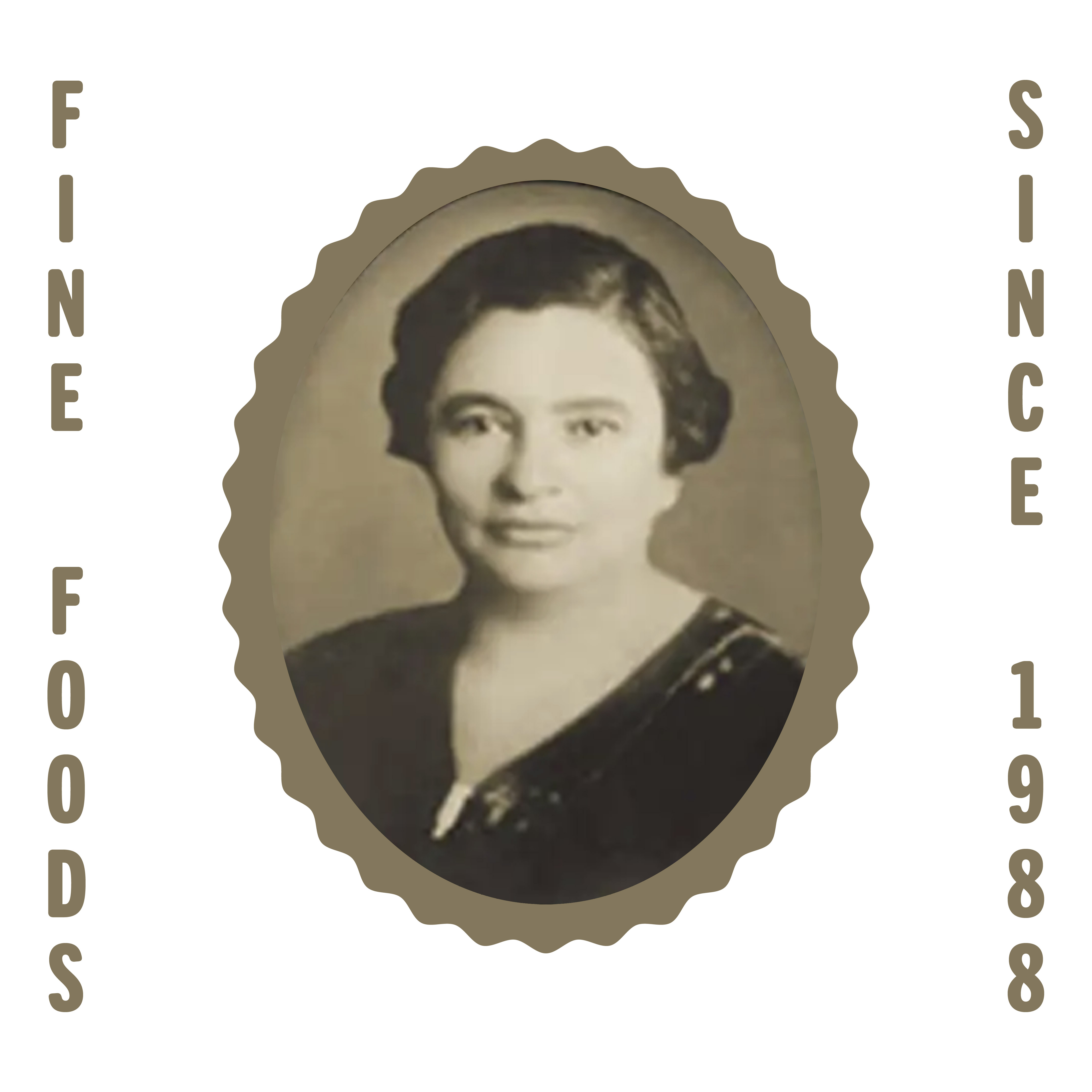
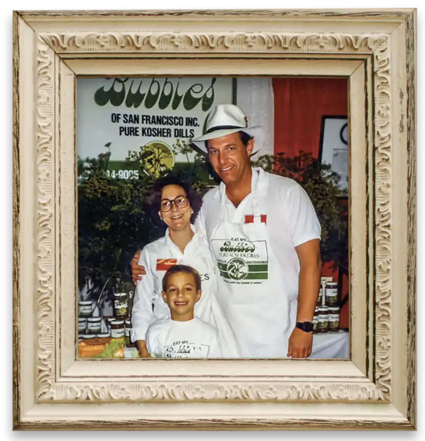
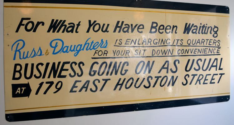
Incorporating Bubbies’ origin story was essential. This early iteration of Bubbies branding (left) was a major typography + style reference. This version of Bubbies lived in corner stores and delis in San Francisco; The updated re-brand had to be able to live in that context, but also traverse time and space to steal the spotlight in today’s pickle aisle.
![]()
![]()
![]()
Incorporating Bubbies’ origin story was essential. This early iteration of Bubbies branding (left) was a major typography + style reference. This version of Bubbies lived in corner stores and delis in San Francisco; The updated re-brand had to be able to live in that context, but also traverse time and space to steal the spotlight in today’s pickle aisle.

+
Outcomes


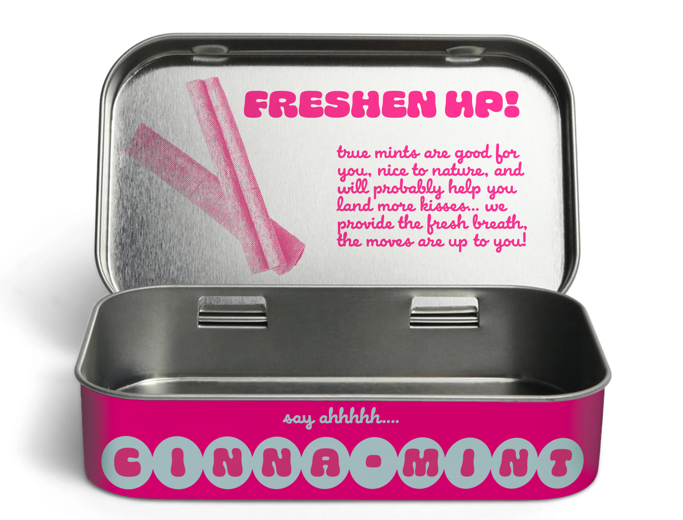
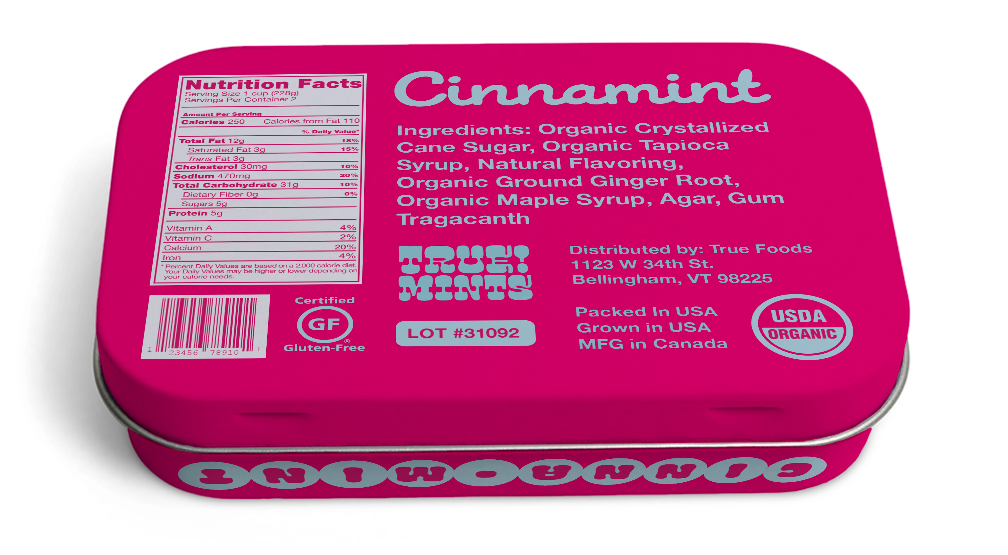
True Mints
Branding + Identity, Packaging Design, Copywriting Revision
2022
2022
A playful, ingredient-oriented packaging rebrand for True Mints, a sustainability focused orangic mint company. I was tasked with a packaging rebrand that highlighted the company’s commitment to simple, natural, ingredients in an approachable, non-pretentious way. Meshing playful type with bold color combinations, the final labels call to mind the hallmark of the brand: simple, fresh, organic ingredients.


+
Process


+
Outcomes
Alaska Airlines UX
UX, UI, Wireframing, User Research, User Testing
2022
2022
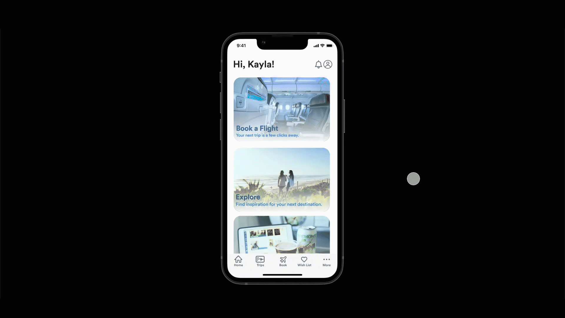
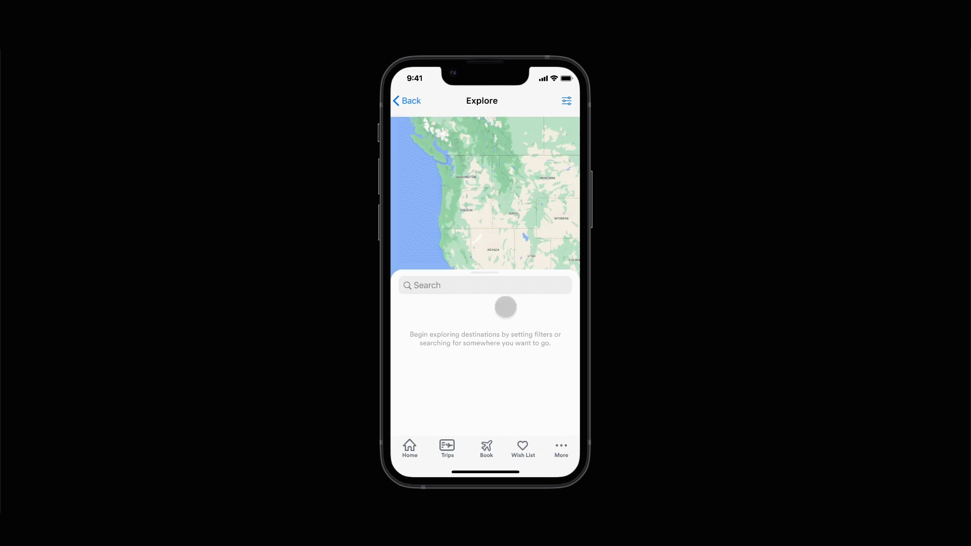
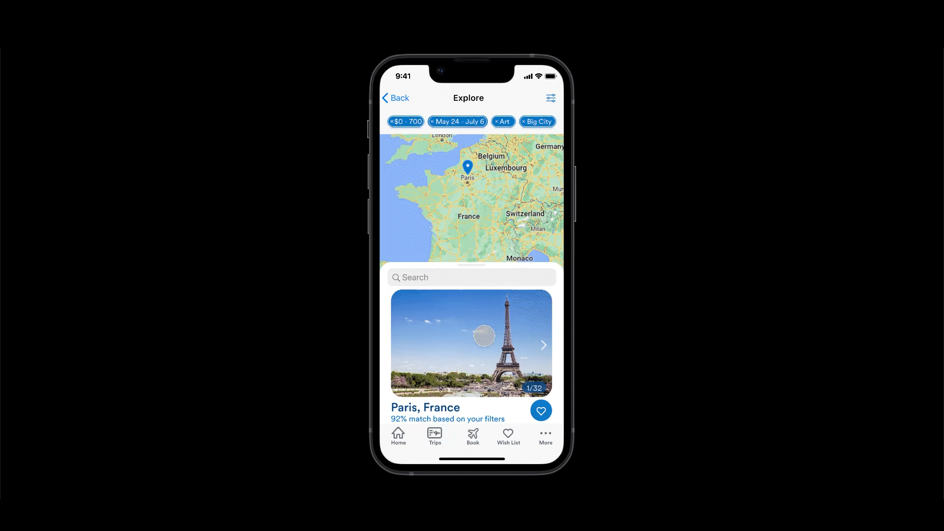
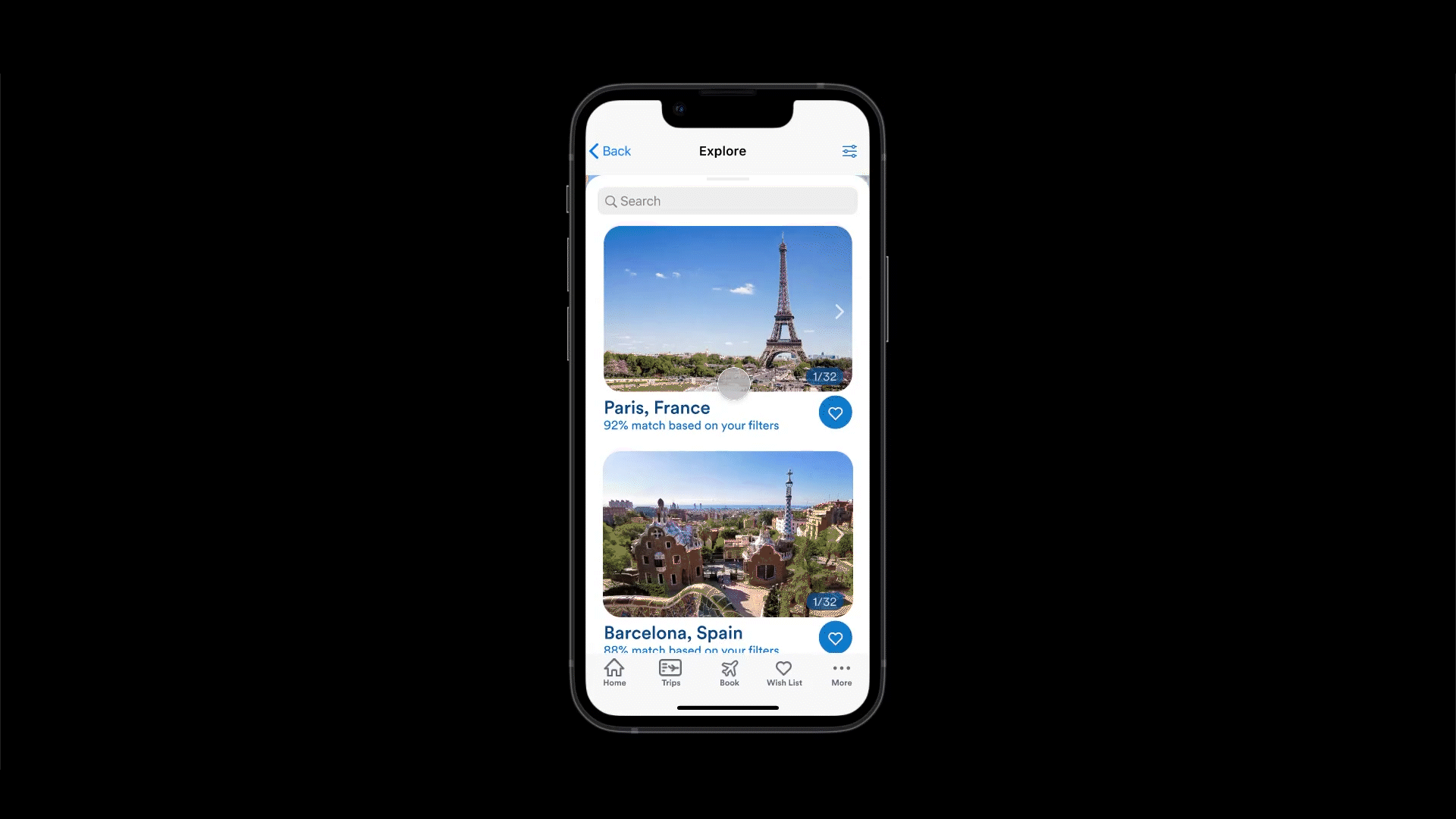
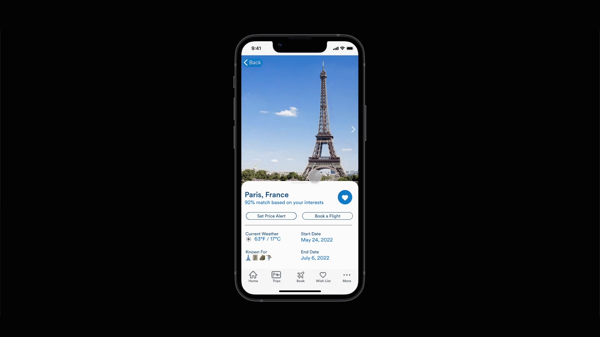
Researched, prototyped, designed, wireframed and tested new features for the Alaska Airlines app.
Brief: Use personalization to inspire exploration for occasional travelers looking for travel inspiration in their booking experience, using joy as the guiding principle.
Team: Olivia Chasteney, Jady Ankeny, Corey Chandler
Case Study
Brief: Use personalization to inspire exploration for occasional travelers looking for travel inspiration in their booking experience, using joy as the guiding principle.
Team: Olivia Chasteney, Jady Ankeny, Corey Chandler
Case Study

+
Process
While the current Alaska Airlines app is functional and can be used
to book flights, there are limited features on the app. For users who
want to explore and learn more about potential destinations they
can travel to with Alaska, there is no option for them.
Another pain point that was discovered through our surveys and
interviews was that fluctuations in the price of flight tickets were
unpredictable and caused users stress about whether they were
getting the best deal or booking their flight tickets at the right time.
+
Outcomes

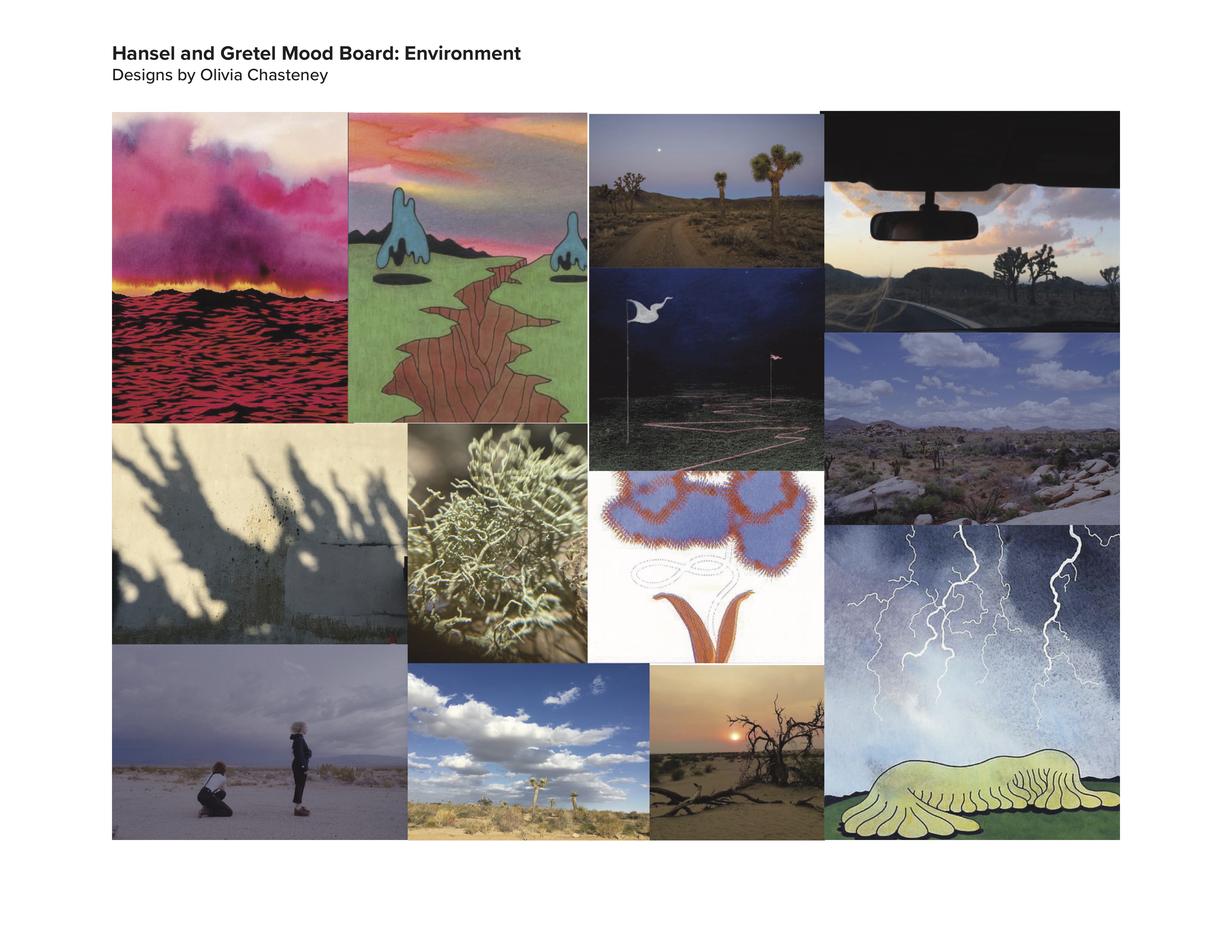
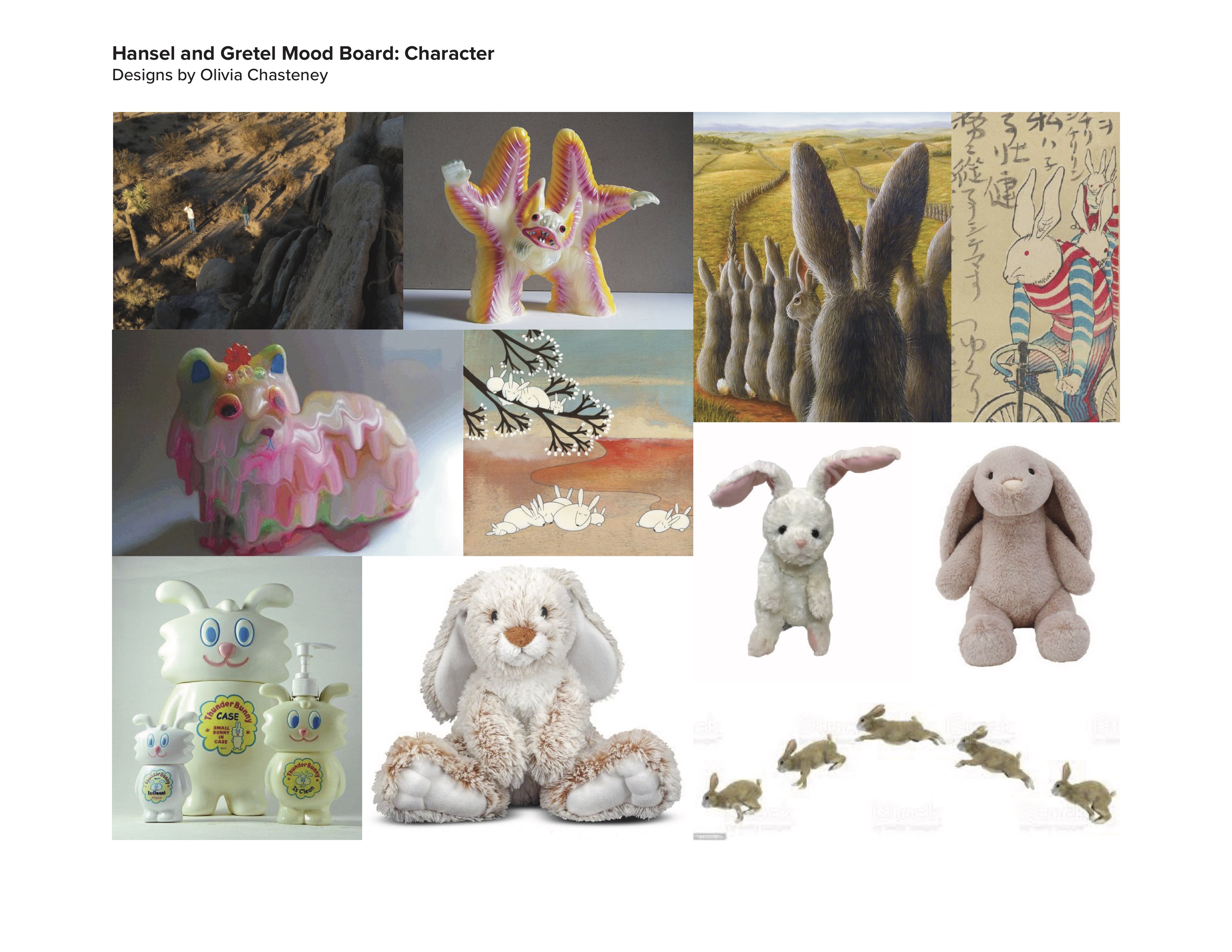
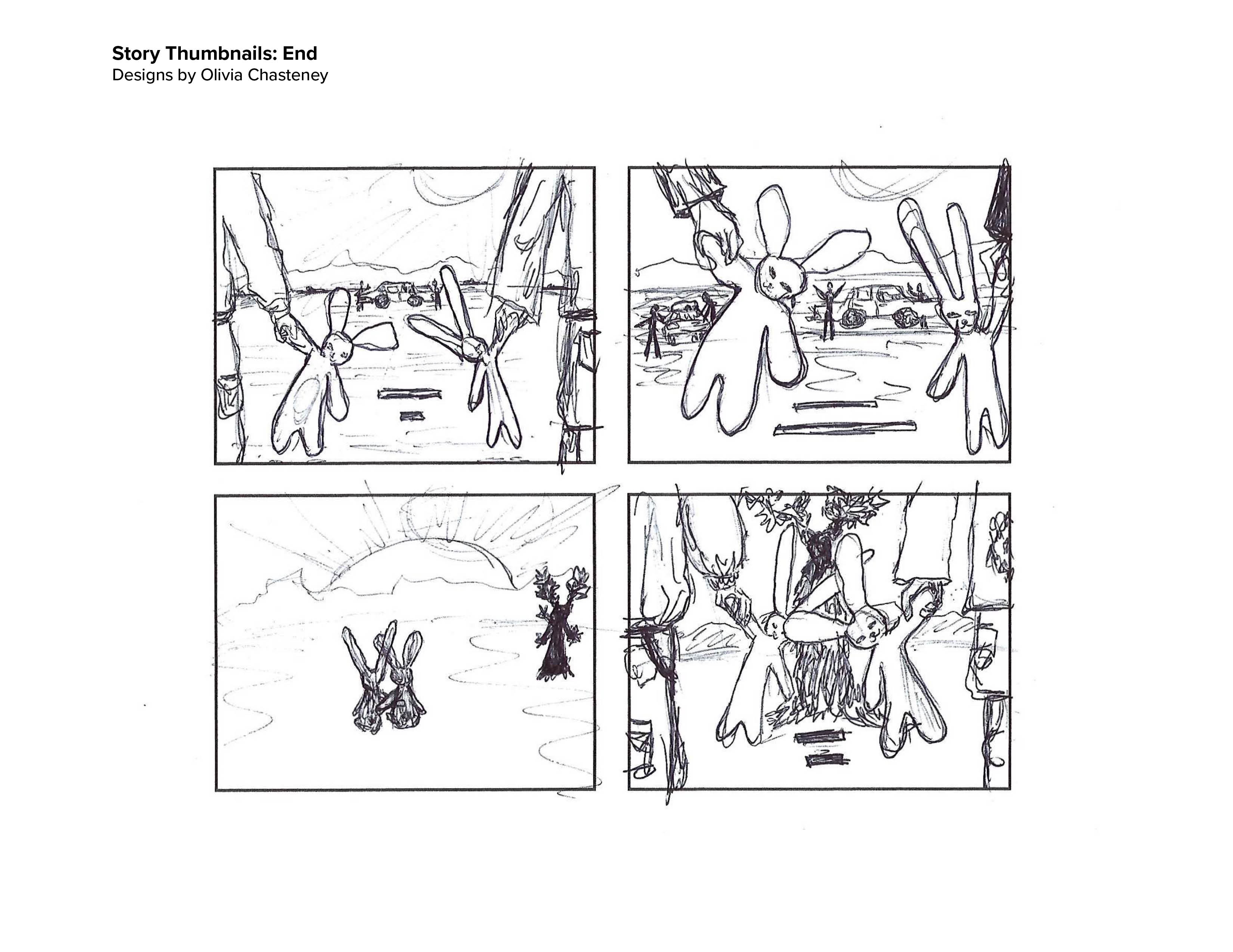
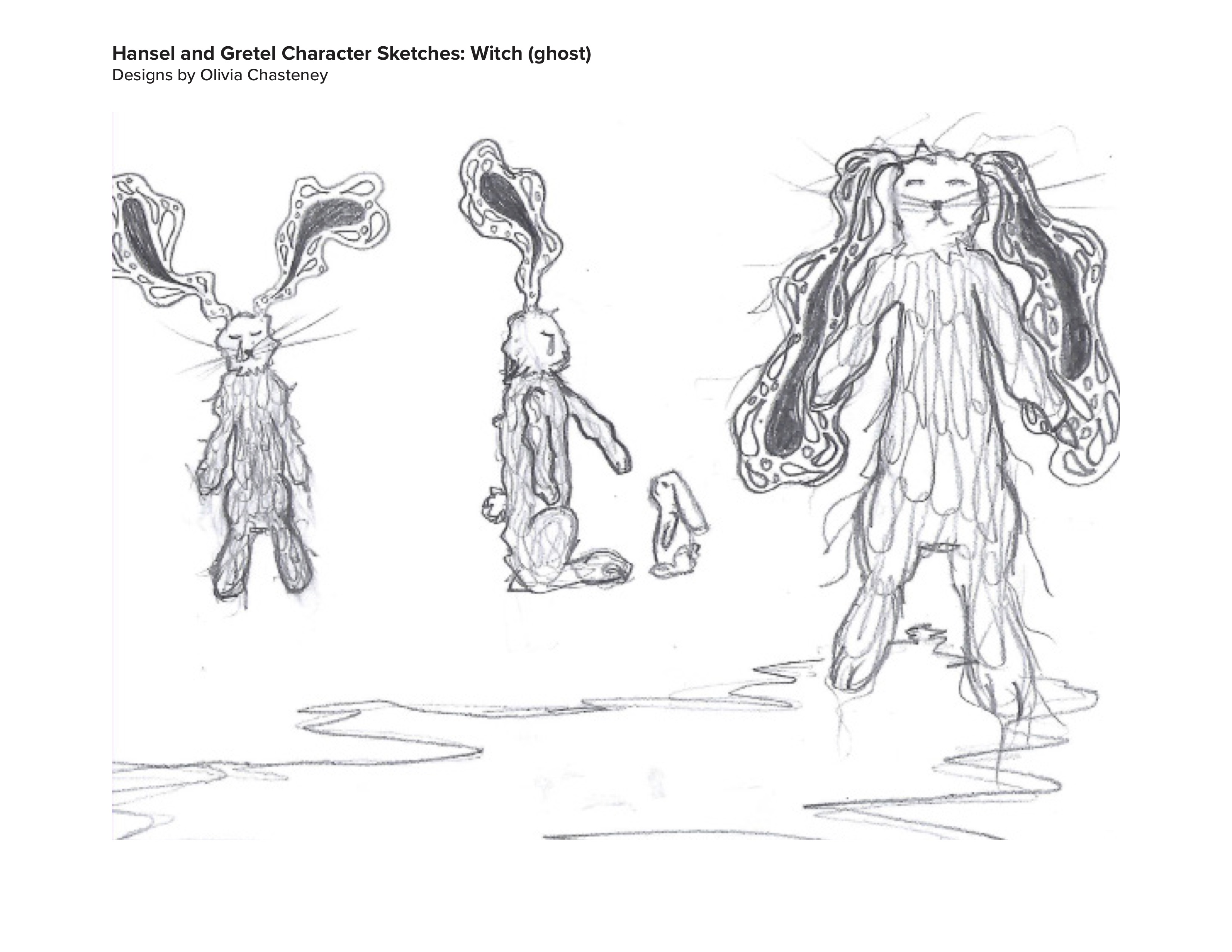
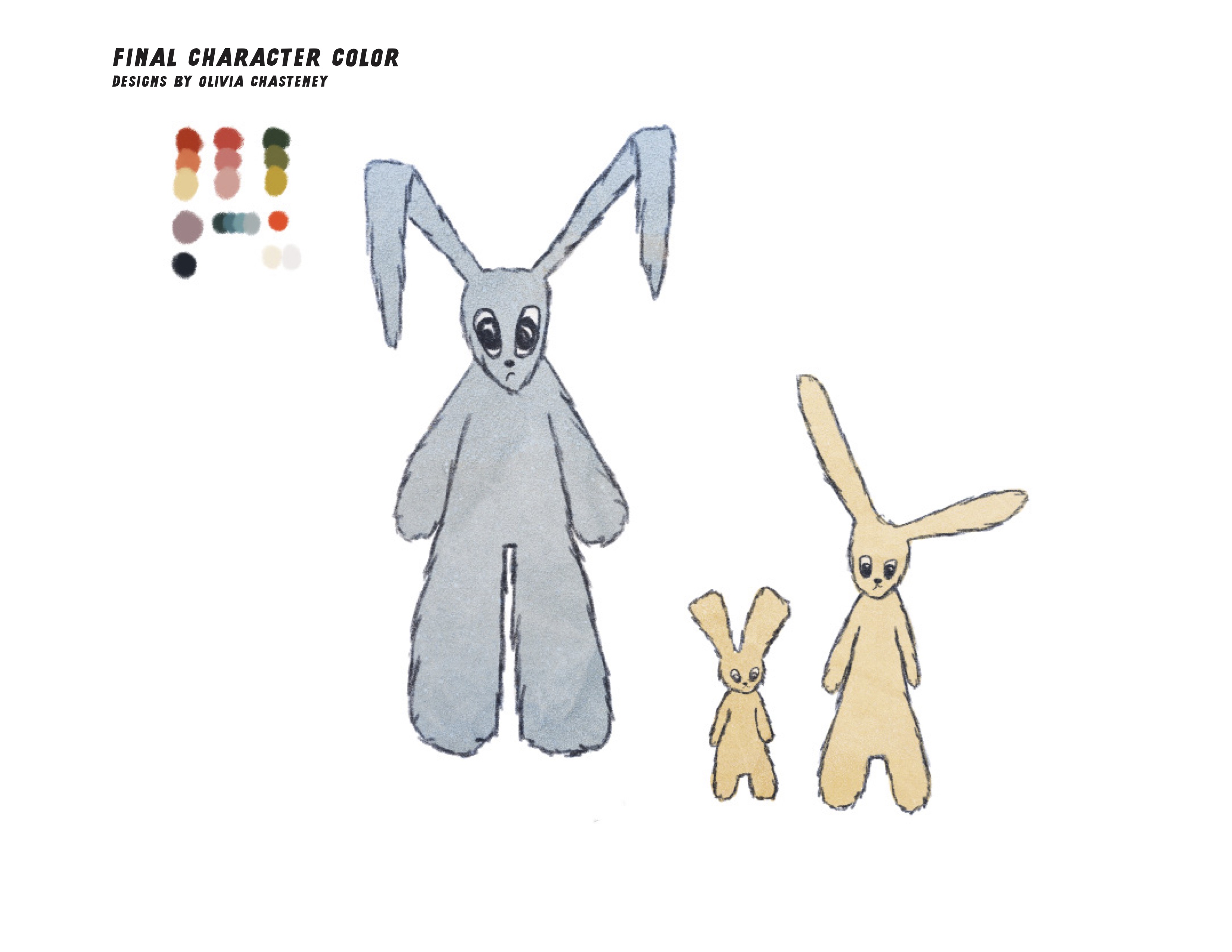
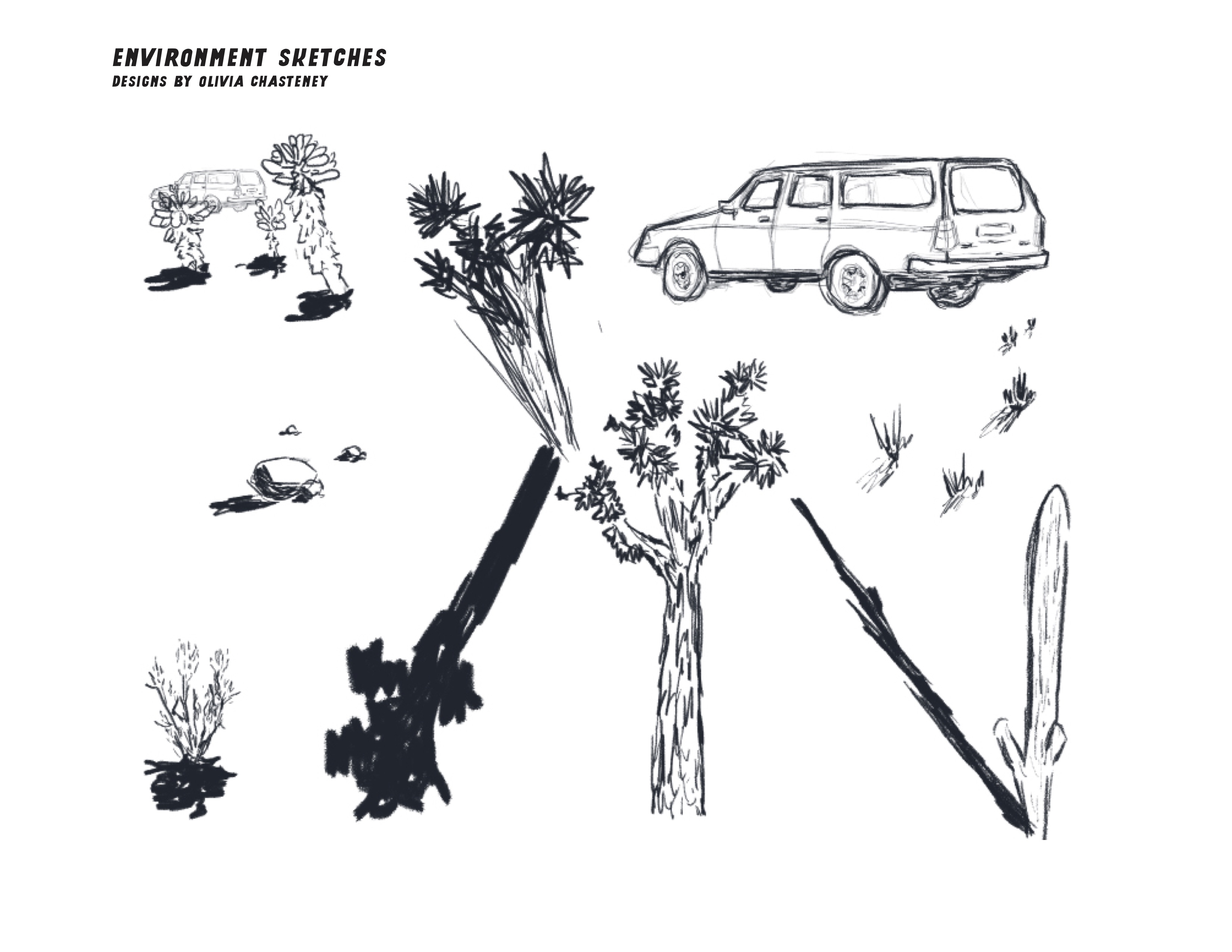
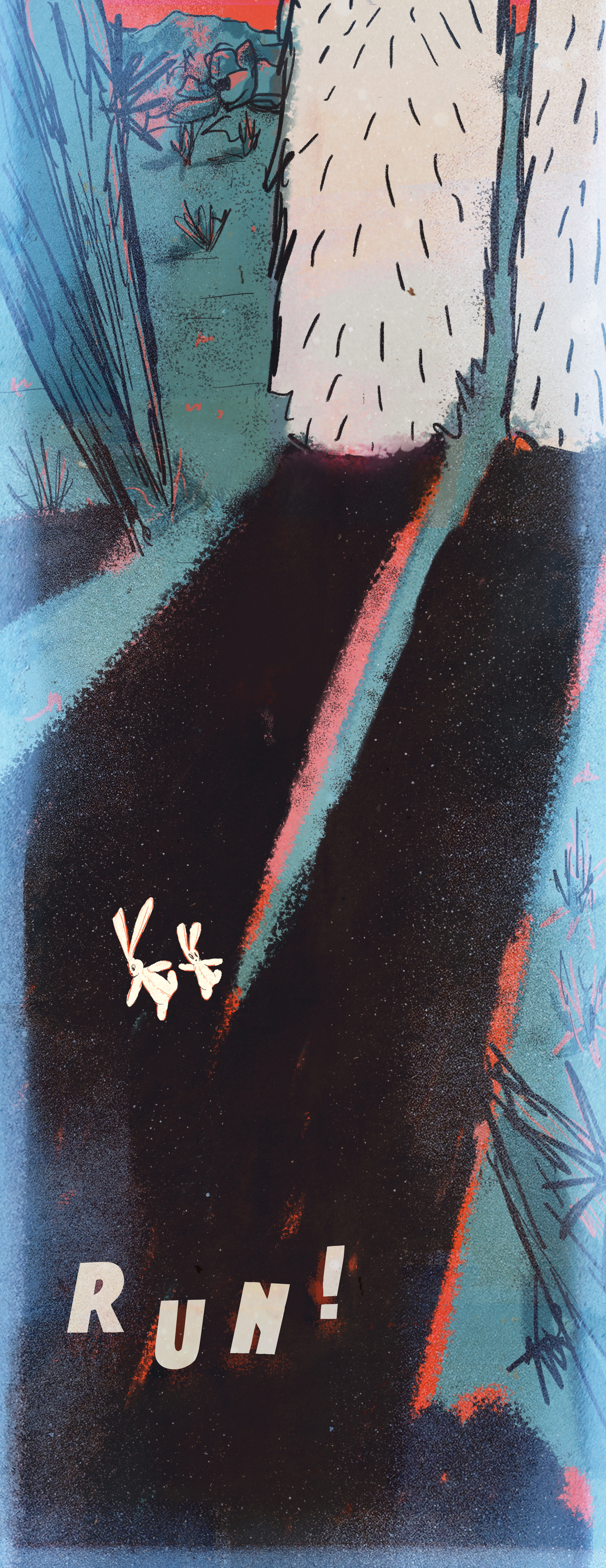
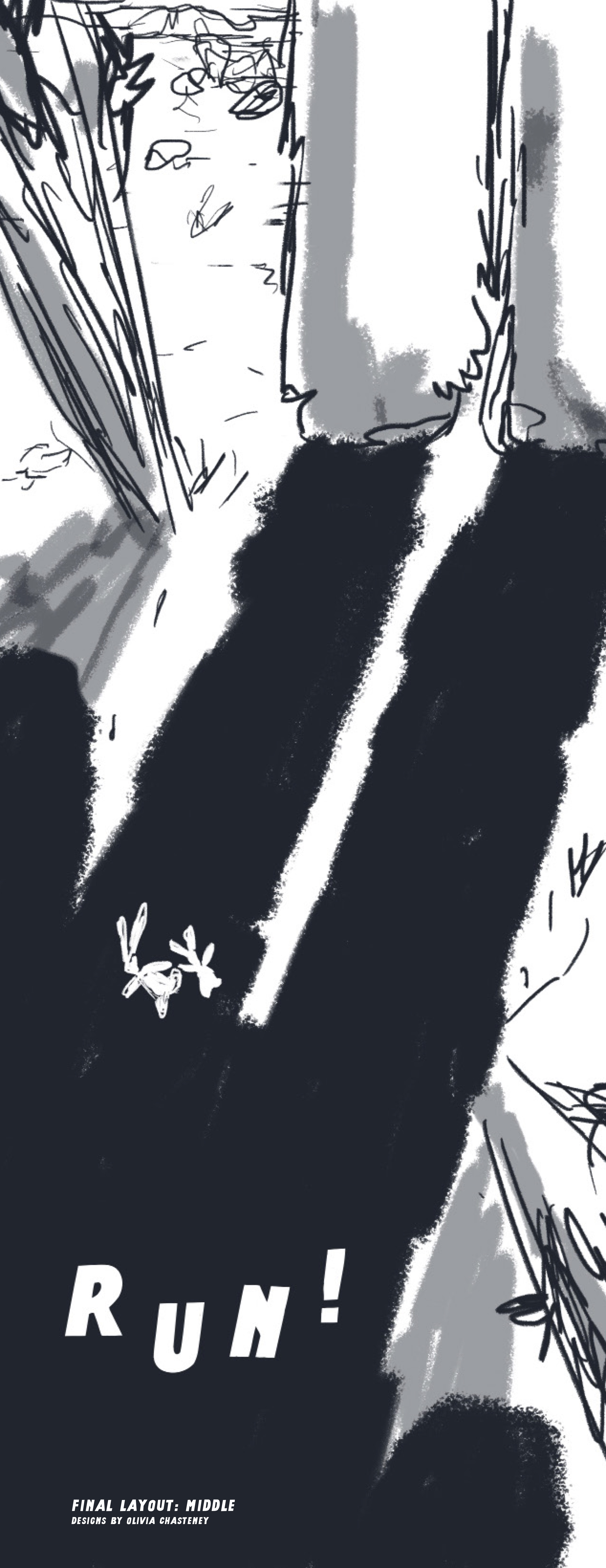
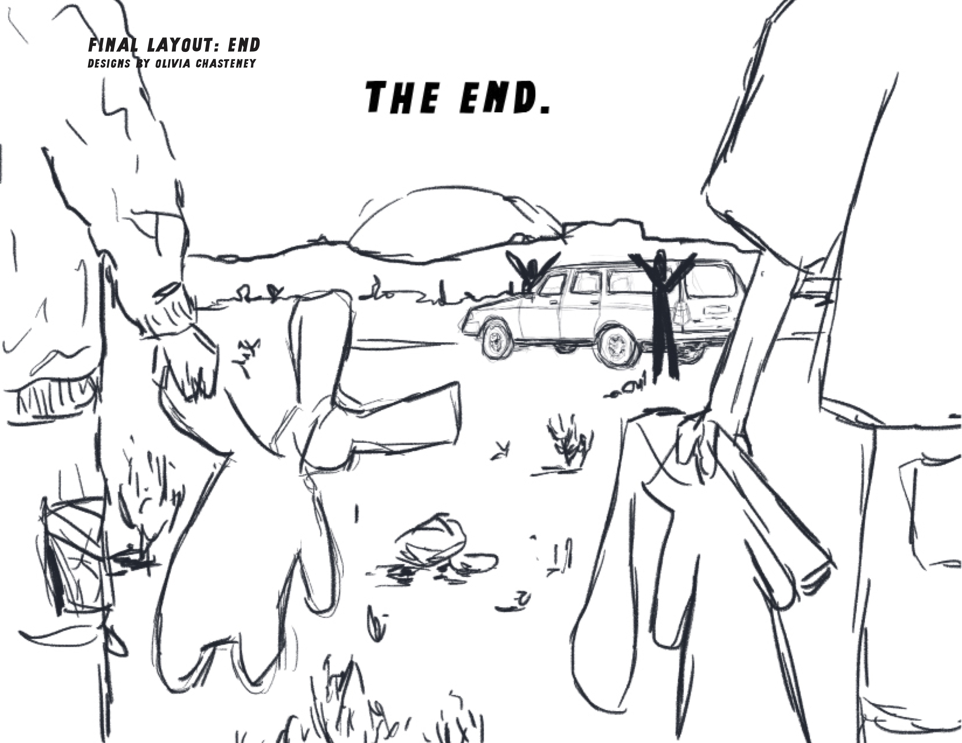
Dust Bunnies
Book Design, Illustration, Character Design
Concept, character design, and Illustrations for Dust Bunnies, a children’s book concept.